english-for-designers
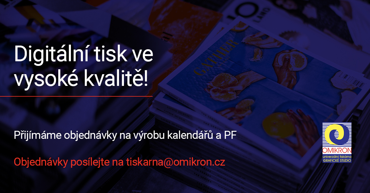
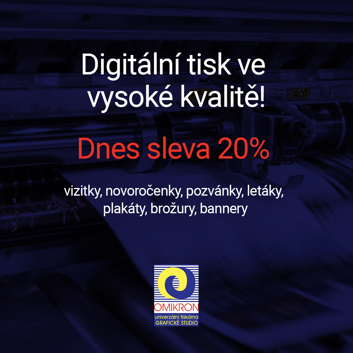
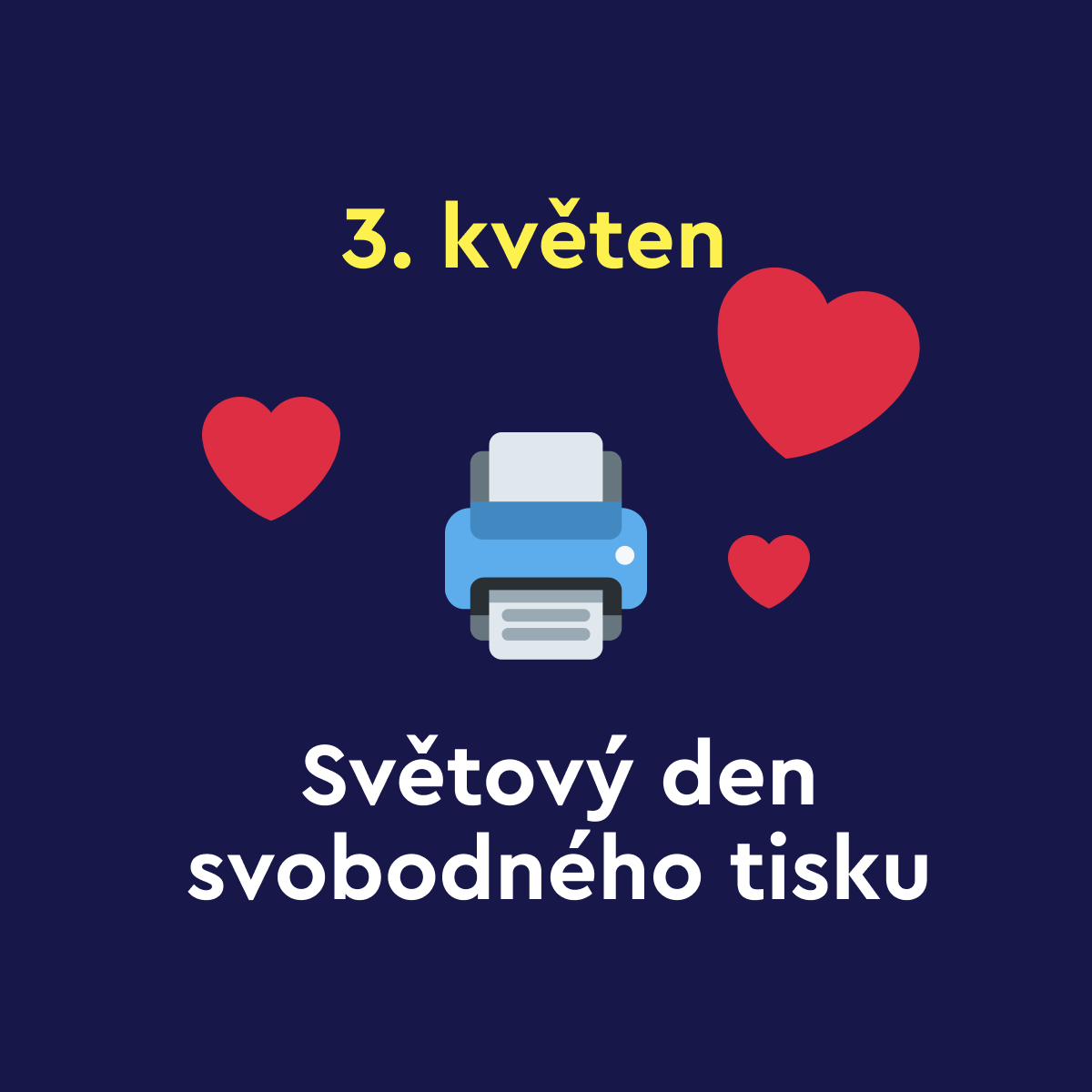
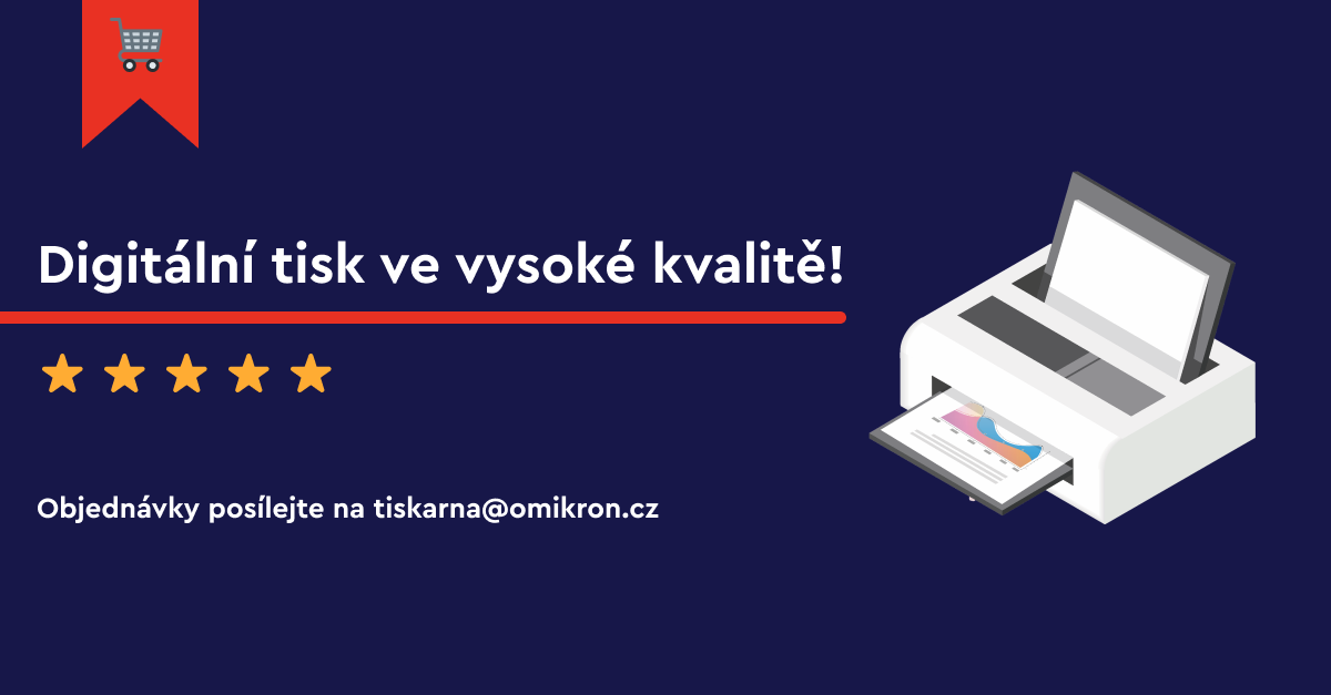
Commertial adds for printing company
Problem
The main problem in this case was lack of attention cathcing content on social media and also inconsistent graphics. Many people knew about the company but the social media background wasn’t sufficient enough to bring new customers in.
The company didn’t use corporate identity, although they had one, in any form of communication, which has negatively affected the overall immage of the company on most of the digital platforms.
Action
I started the process by sitting down with the company’s staff to discuss how they work, what the customers usually order and how they’ve been communicating so far. I have also asked for a copy of their CI in order to deliver a graphic design solution which would not only look great, but would also reflect their norms and standards.
Once I had the boundries all set up, I began to draw some sketches to find a style which would suit the company. This is usually my favorite part of the process because I have the freedom to really be creative in this stage of the process.
From the initial sketches I wanted to incorporate key elements which would best describe the companys industry. In this case, it was pretty obvious. I’ve used photos of their products, because when a customer sees the ad/banner/header, they will be able to tell right away, what this company is about. I have been asked to make samples of possible social media ads that would help with these issues. I used colours given by CI of the company and the power of contrast to catch the attention of the viewer. For the background image I used the companys print products.
During the design process I created multiple materials for later use such as product photography, online ads and banners that can be used in various forms of digital communication.
Result
In my opinion, the client chose the design with the most contrast out of several design options, all of which reflected and contained their CI. The client can now use my work in many forms as I have explained earlier. It is not just a facebook add, but I can be similarly used in e-mails, banners, headers, etc. I think our work paid off because we`ve managed to capture the core elements of the company and we were able to reflect that into the final design.


